Design Concept — 2019
Microsoft Edge for iOS redesign
A focus on one-handed usability and new cross-device experiences.
Not affiliated with Microsoft
Microsoft Edge for iOS redesign isn't affiliated with Microsoft. Concepts and mockups shown do not represent any product plans past, present, or future.
Designing mobile browsers is hard. Fitting the web in the palm of your hand has been a challenge that has been solved to varying degrees of success over the years.
I'm a firm believer that Windows Phone had one of the best browser navigation paradigms ever created. All the controls were located at the bottom of the screen, easy to reach without stretching. This was especially good on larger screens.
Yet for some reason, no other mobile browser has adopted a similar UI. A lot of them make a compromise, with a toolbar at the bottom and the address bar at the top. I believe all of the elements should be at the bottom--just like Windows Phone.
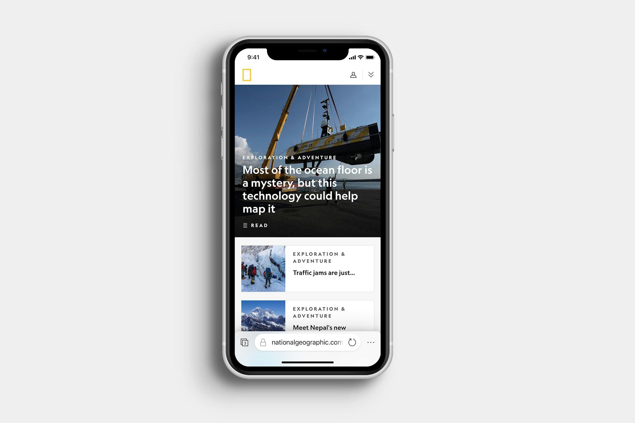
This new design for Edge mobile places an emphasis on usability. All navigation controls are located at the bottom of the screen. The address bar takes up most of the space, with buttons to the left and right for entering the tab view and opening the menu respectively.
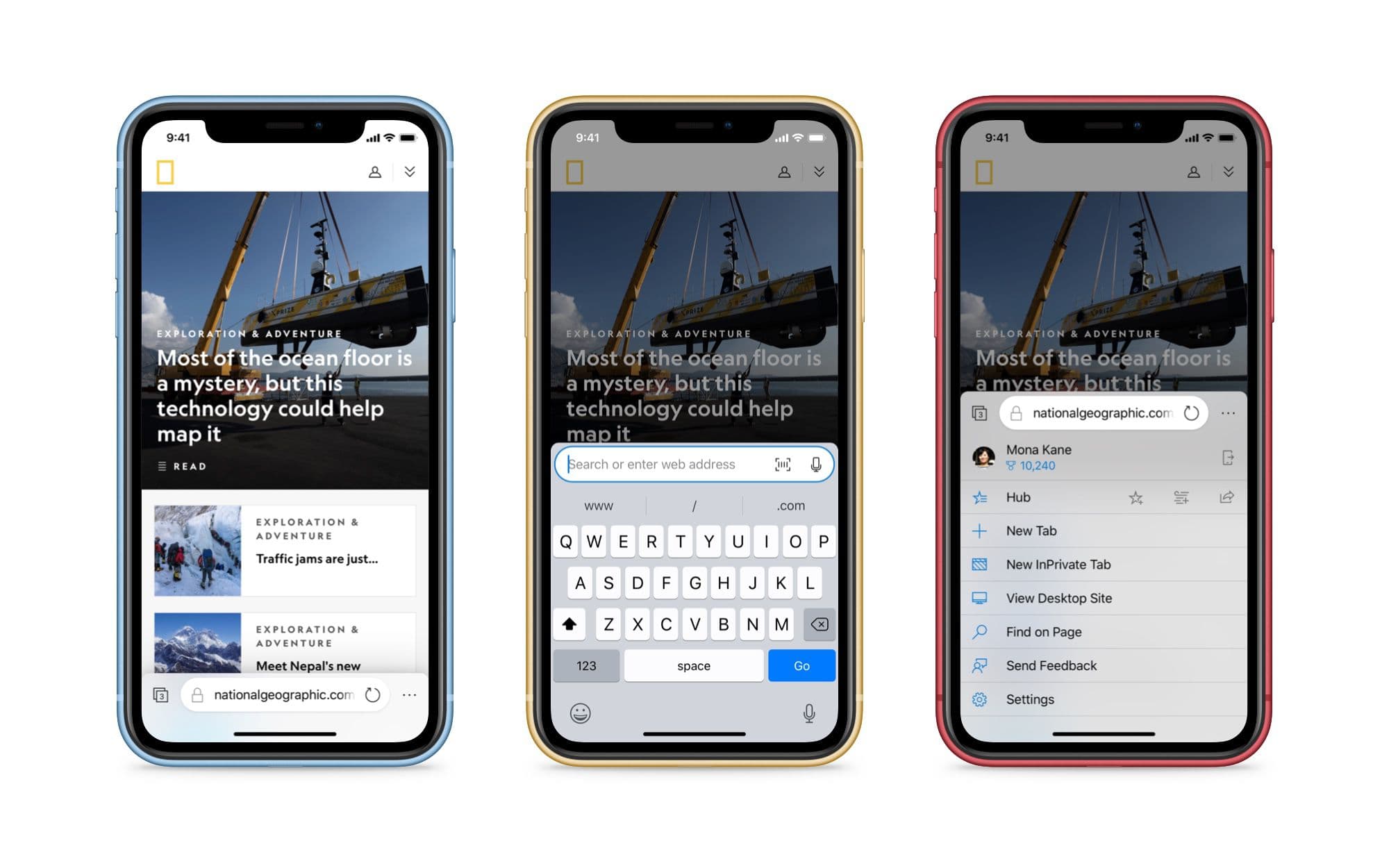
The menu itself slides up from the bottom and provides the same options as are available in the Edge browser today. They've been re-arranged to take up the full-width of the screen for easier tapping.
Synced Tabs
A rather useful feature that was included in Internet Explorer 11 for Windows 8.1/Windows Phone 8.1 was tab syncing. You had the ability to access tabs from your phone on your PC, and vice versa. With this redesign, I have brought back this feature.
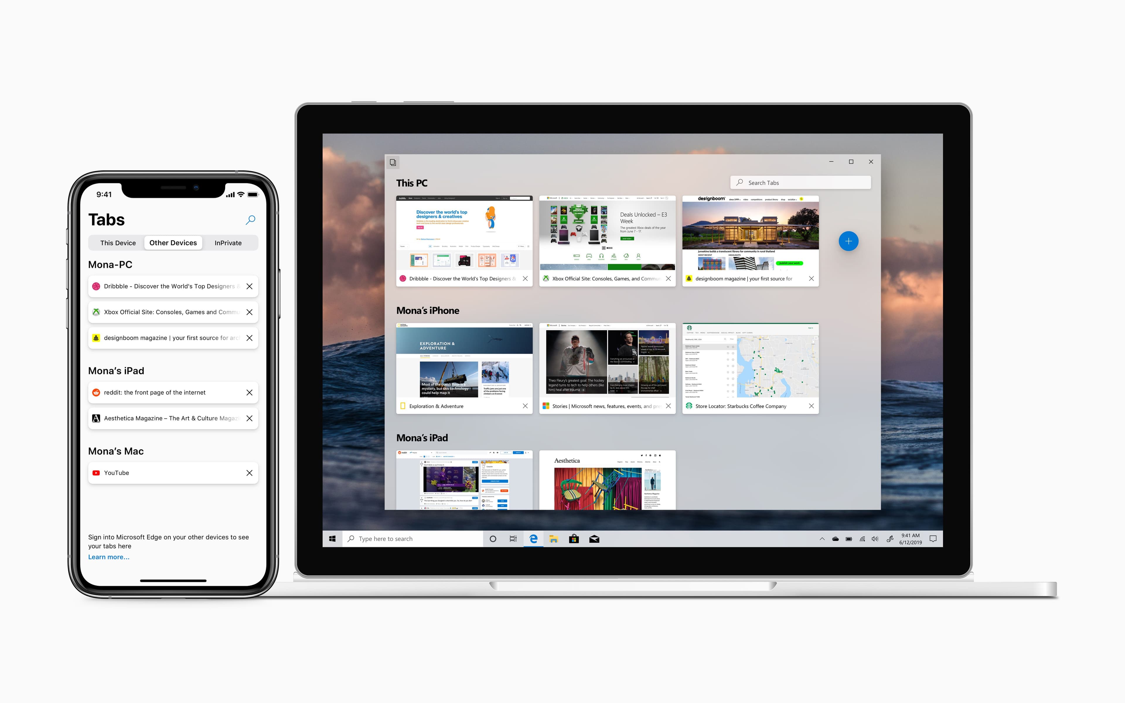
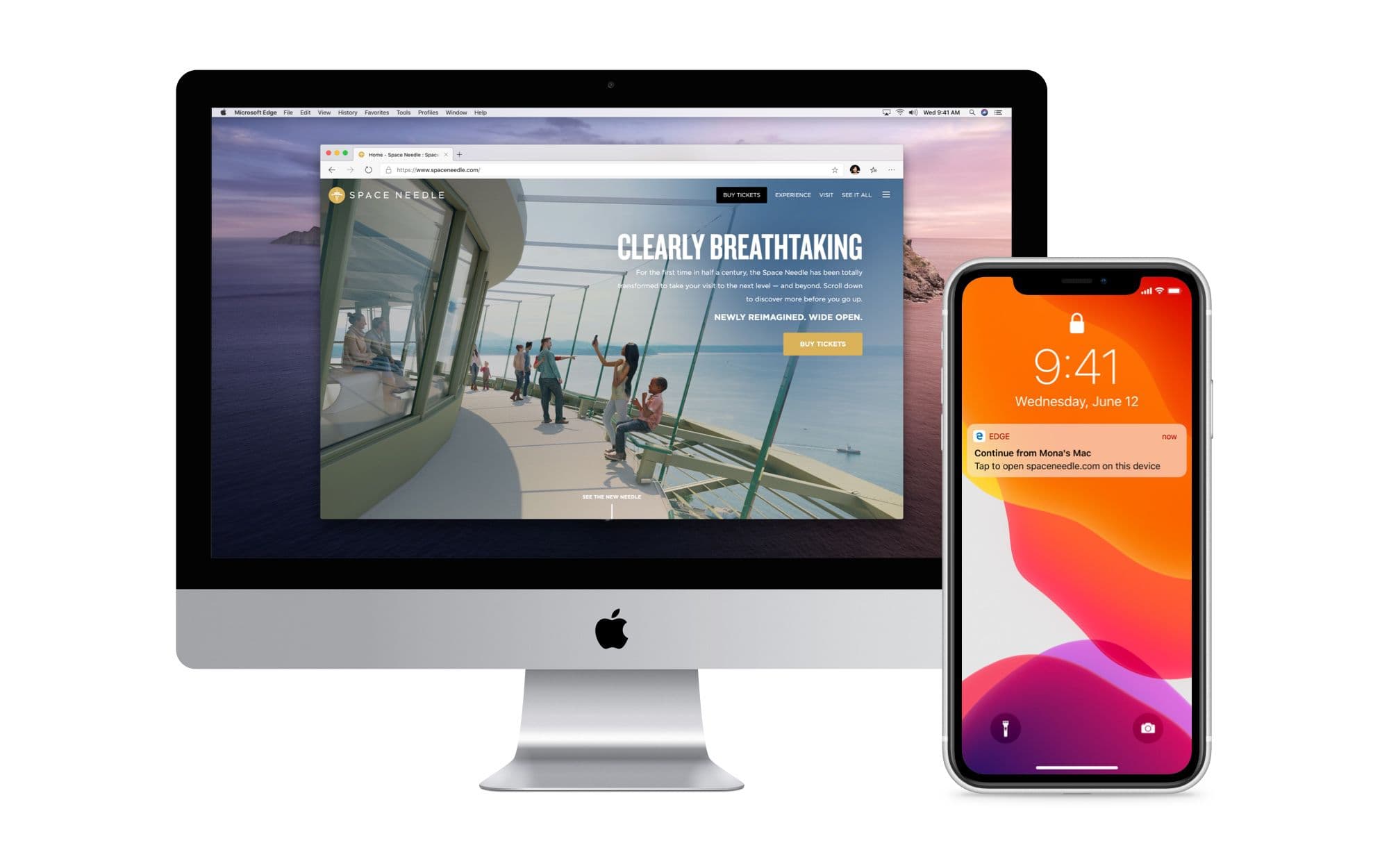
Tabs can be synced between all sorts of devices now that Edge is available everywhere, not just Windows-based platforms. In addition, if you have a tab open on one device and then pick up another, there is a new notification that prompts you if you want to continue browsing on that new device.
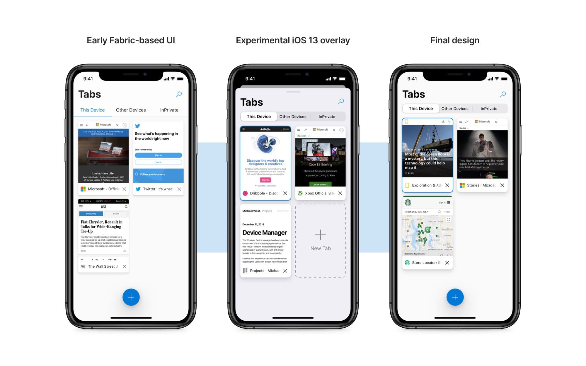
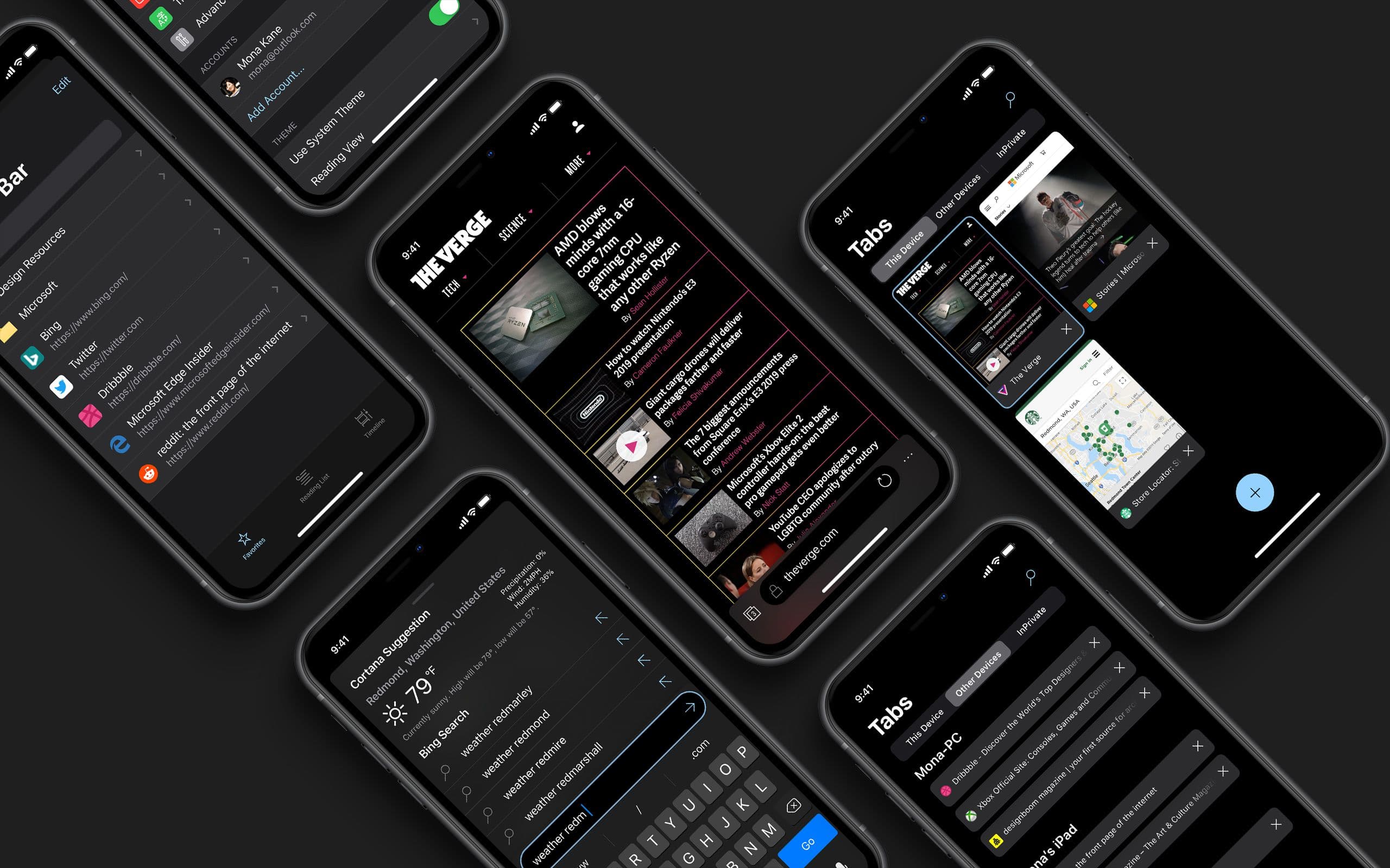
The tab view itself went through multiple iterations before I settled on the final design. Originally I used the Microsoft iOS Fabric-style segmented control (furthest-left screenshot), but with iOS 13 there is a new segmented control that has "depth" thanks to new shadows. I decided to adopt this control as it feels more in line with Fluent Design on the desktop.
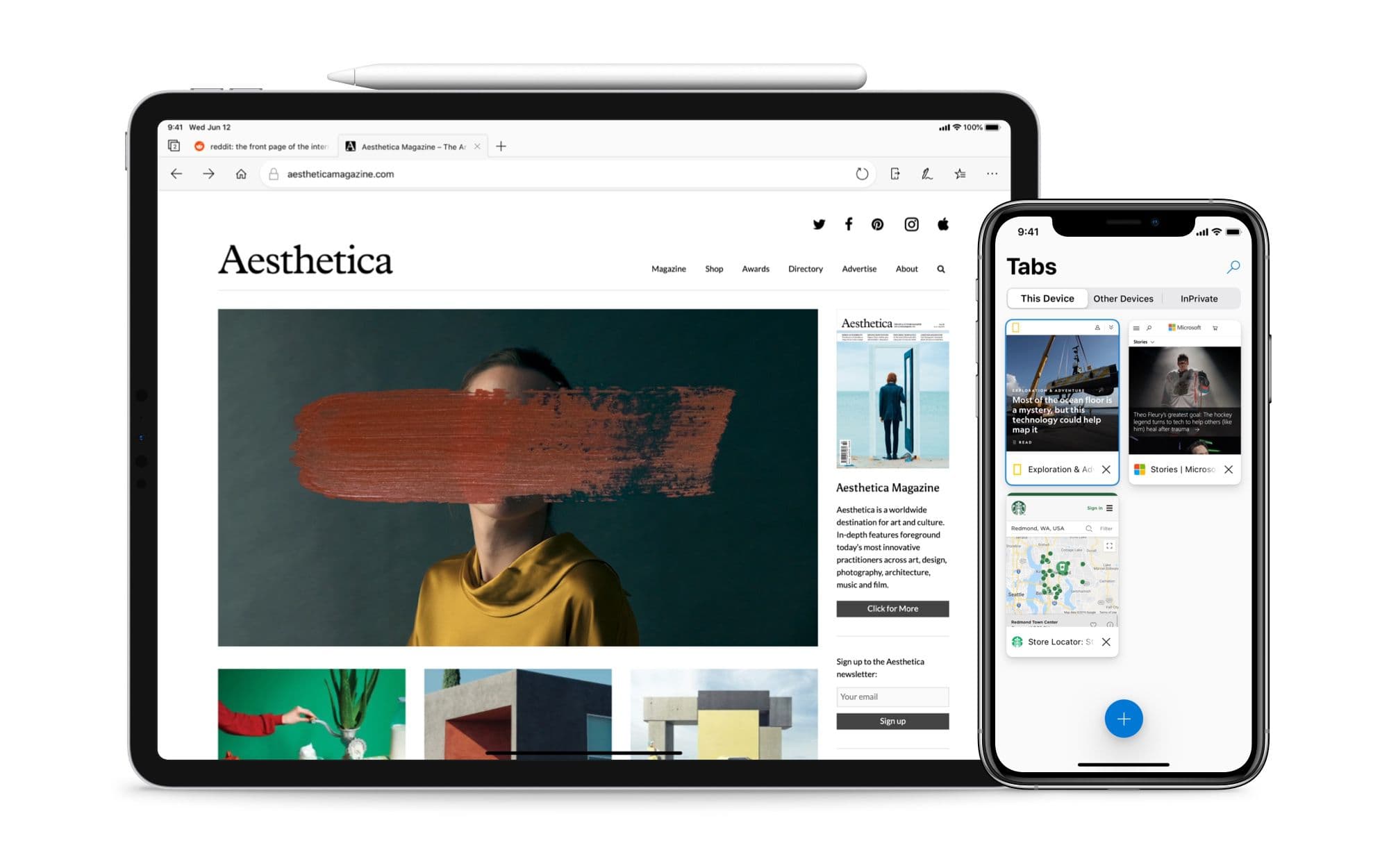
On iPad, the tabs now adopt the same rounded corners as on the desktop version of Microsoft Edge.
Menus, Settings, and Search
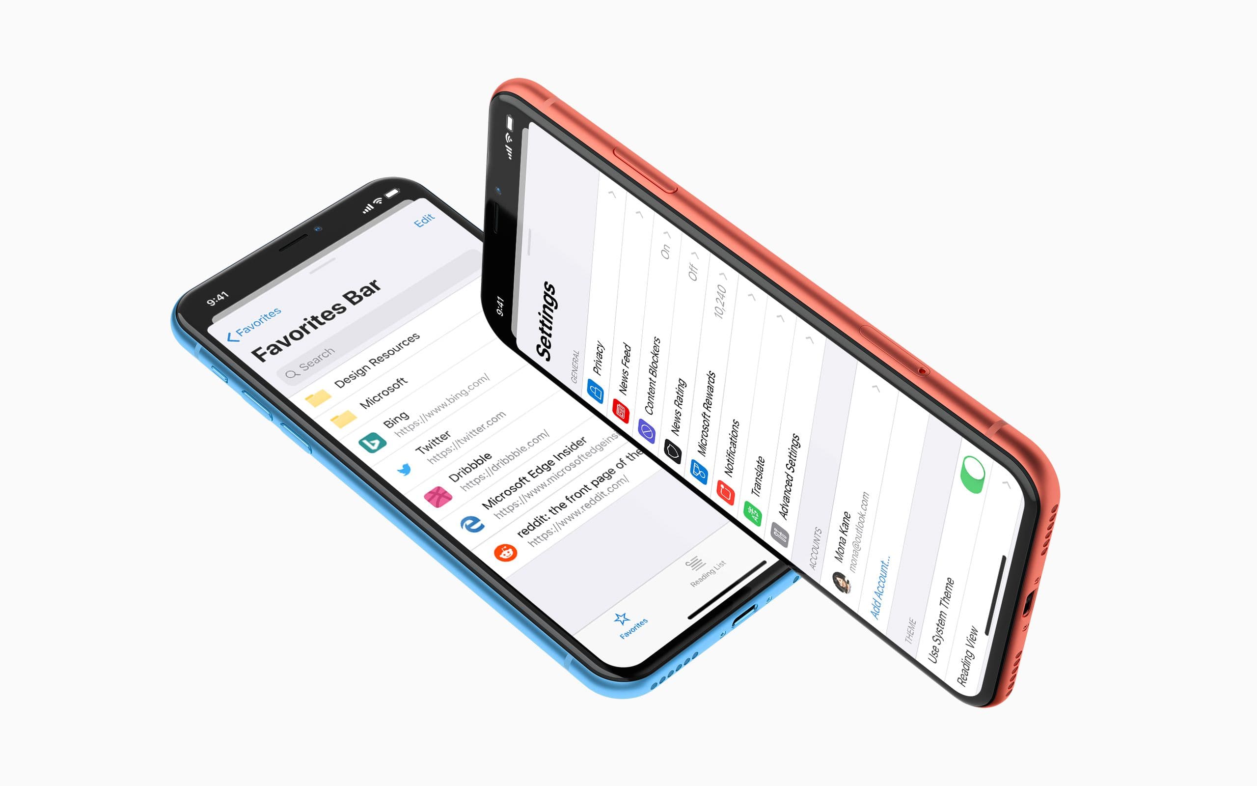
The Hub and Settings pages both use the new iOS 13 modal panel. This helps provide a sense of context and allows the user to swipe down to easily dismiss. The new Settings page has new icons next to many of the subcategories for easier identification.
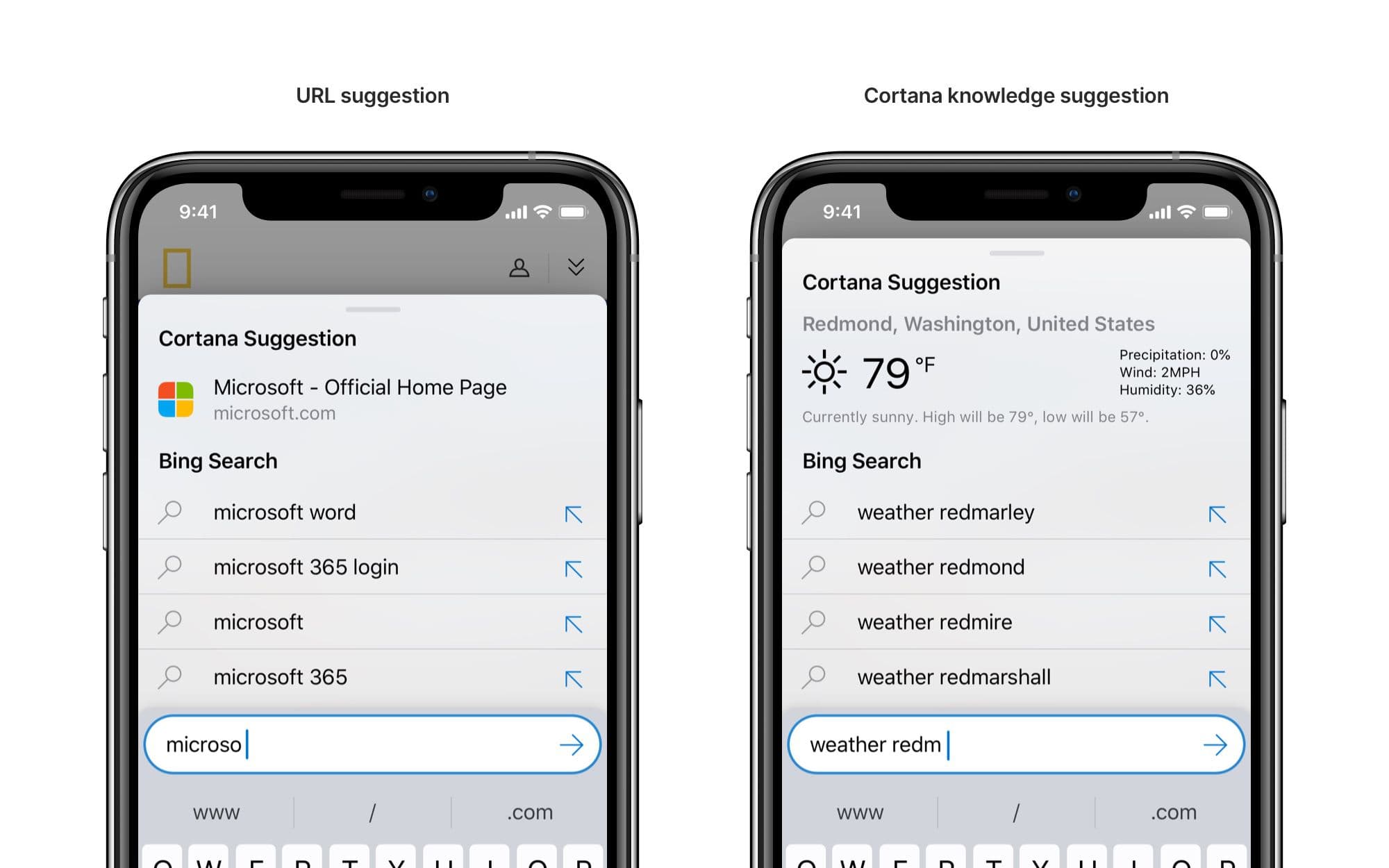
The Search experience has also been evolved with a new "Cortana Suggestion" region. This is similar to the suggestion area in the outgoing version of Edge on Windows 10--typing in a query can show a top site or a knowledge suggestion.
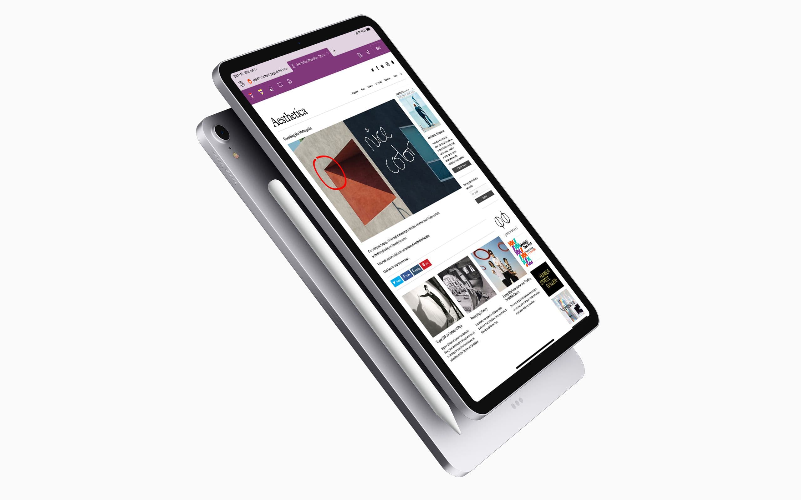
Inking on iPad
I also decided to add inking capabilities to the iPad version of Edge. These mirror the capabilities of inking in the outgoing Windows version of Edge. These Web Notes can be saved or shared.
Dark Mode
With the new style guidelines given for the upcoming Dark Mode in iOS 13, I thought to also redesign the dark interface of the Edge app.
While this design focuses on iOS, a lot of these improvements can be applied to Android too.
The new design also works there, with minor changes to adopt Material Design patterns. Inking could also be added to certain Android phones—such as the Galaxy Note line.
If I ever get around to making mockups for the Android version, I'll link to them here.