I currently work on Windows, where our team focuses on making your PC experience more powerful and delightful with AI, while also scaling new tooling across the studio.
I'm a self-taught designer with an engineering background, specializing in simple and effortless experiences for both the devices we use today and the ones we'll use in the future. Crafting high-quality products that people love to use is my passion, and I work tirelessly to achieve that goal.
Using the medium of motion and rapid prototyping I bring these experiences to life, visualizing the smallest interactions to entire user journeys. I strongly believe in open design, and encourage co-creation that can help deliver a better solution for users.
Accessibility and inclusion sit at the center of my process — technology should empower everyone and nobody should be left with a subpar experience.
I'm currently a Senior Designer at Microsoft, where I currently work on Windows AI.
Previously a Design Intern at Microsoft, where I was involved with products used by millions of people around the world. Check them out: Surface Duo, SwiftKey, Fluent Icons. Before that, I worked independently on critically acclaimed concepts both by myself and friends.
BSc Computer Science graduate — First Class Honours.
Awarded 2018-19 Microsoft MVP (Most Valuable Professional) for Windows Design.
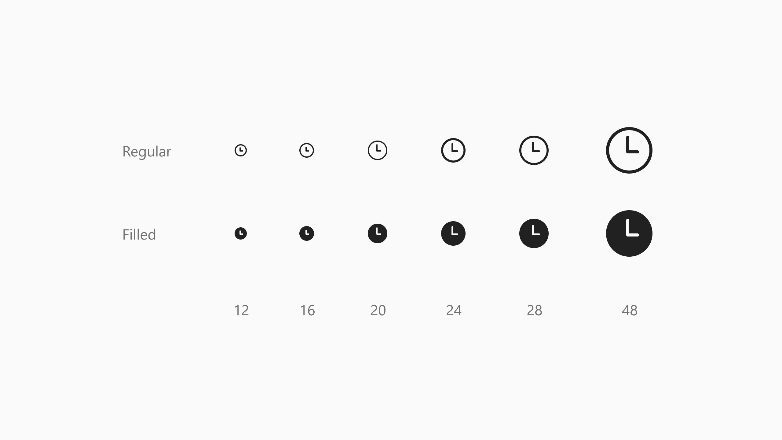
Fluent Icons are Microsoft's monoline icon set. They're built from the metaphors of the older MDL2 family the Windows team had used for years, but with rounded corners, end-caps, and a hand-tuned ramp from 16 to 48 units. They complement the broader Fluent Design System and the full-color app icon work happening in parallel across Office, Windows, and other product teams.
I was part of a team spanning designers from across the company that laid the groundwork for this icon system. We were able to quickly scale the system from a handful of icons to thousands over a few months. Using an agile approach we were able to release new icons every week, prioritizing icons for teams that needed them immediately.
Why thin
The default Fluent stroke is 1.5px at 24×24. That weight clashed for Microsoft SwiftKey. Our themes used a much lighter visual register, and the typography across the keyboard was tuned to match. Dropping 1.5px icons directly into the keyboard looked visually off; they were heavier than the surface they sat on.
Solving that locally inside SwiftKey would have meant a much broader redesign across themes, type, and component density. But we could approach the problem from upstream instead, with a new weight in the icon system itself sitting alongside outline and filled, and also available to any team facing the same problem.
Drawing the system
Working with the rest of the Fluent Icons team and the central Design System Studio, we set the rules for the new weight: naming, modifier behavior, the relationship between thin and the heavier weights. I drew a lot of the lightweight glyphs across the size ramp through to the end of my internship, rebuilding strokes from the existing outline geometry to 1px and re-tuning corners and end-caps for the lighter register. I also helped with drawing icons at the regular and filled weights.
The size ramp and outline vs. filled states.
The hard part wasn't any single glyph, but instead holding pixel-grid alignment at 1px while staying harmonious with the heavier weights and making sure that outline → filled transitions still felt continuous. Fluent uses the filled state to indicate selection in some surfaces, so a jarring weight change on tap could have broken the interaction.
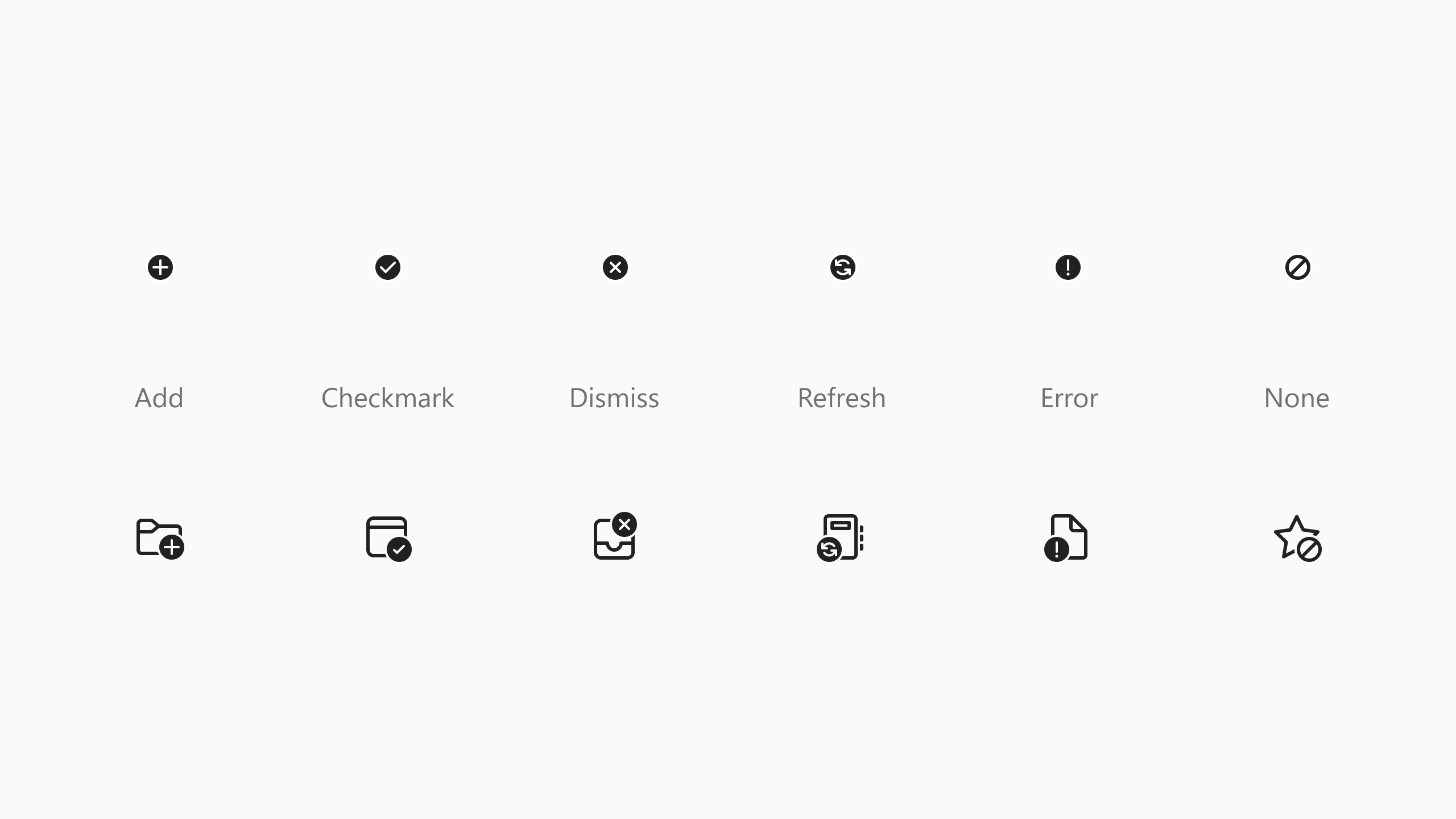
A small subset of the available modifiers.
The modifier system — affixes like a plus or close mark in a consistent corner of the parent glyph — had to survive at thin too. A 1px modifier reads very differently from a 1.5px one at small sizes, and the rules for how the parent glyph cedes space needed to adapt without breaking the spatial conventions users had already learned.
Where it ended up
Thin started as a SwiftKey-shaped problem. It didn't stay one. Other teams began to pick up the lighter glyphs at certain sizes for the same reason. Their interface needed a lighter register than the default weight allowed. And from there thin became part of the standard system, available to anyone who needed it.
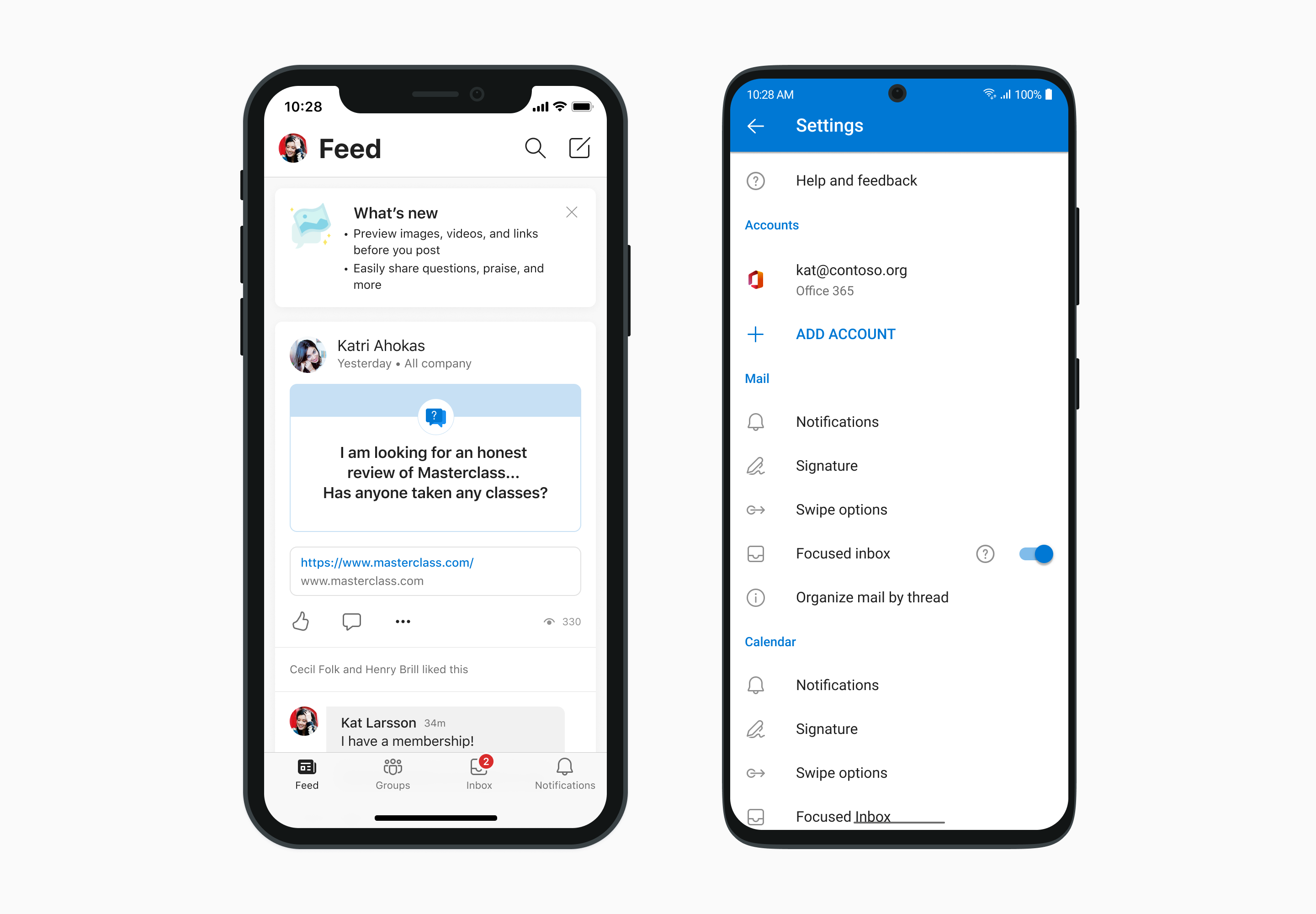
Examples of Fluent Icons in Yammer on iOS and Outlook on Android.
The broader system scaled the same way. What began as a mobile icon set picked up desktop adopters with Microsoft Edge among the first, and later Windows 11. A new 20px size was hand-drawn specifically so the icons could replace existing 16px MDL2 assets in dense desktop UI without losing legibility at the swap.