I currently work on Windows, where our team focuses on making your PC experience more powerful and delightful with AI, while also scaling new tooling across the studio.
I'm a self-taught designer with an engineering background, specializing in simple and effortless experiences for both the devices we use today and the ones we'll use in the future. Crafting high-quality products that people love to use is my passion, and I work tirelessly to achieve that goal.
Using the medium of motion and rapid prototyping I bring these experiences to life, visualizing the smallest interactions to entire user journeys. I strongly believe in open design, and encourage co-creation that can help deliver a better solution for users.
Accessibility and inclusion sit at the center of my process — technology should empower everyone and nobody should be left with a subpar experience.
I'm currently a Senior Designer at Microsoft, where I currently work on Windows AI.
Previously a Design Intern at Microsoft, where I was involved with products used by millions of people around the world. Check them out: Surface Duo, SwiftKey, Fluent Icons. Before that, I worked independently on critically acclaimed concepts both by myself and friends.
BSc Computer Science graduate — First Class Honours.
Awarded 2018-19 Microsoft MVP (Most Valuable Professional) for Windows Design.
Surface Duo asked an unusual question of every team designing for it: what does your product become when there's a second screen?
I joined SwiftKey as a design intern in the lead-up to Duo's launch and worked on adapting the keyboard to a form factor where input conventions hadn't been established yet. Input is one of the most consequential surfaces on a phone. When it's wrong, the rest of the device feels broken. And a dual-screen device gives a keyboard more places to live than it knows what to do with.
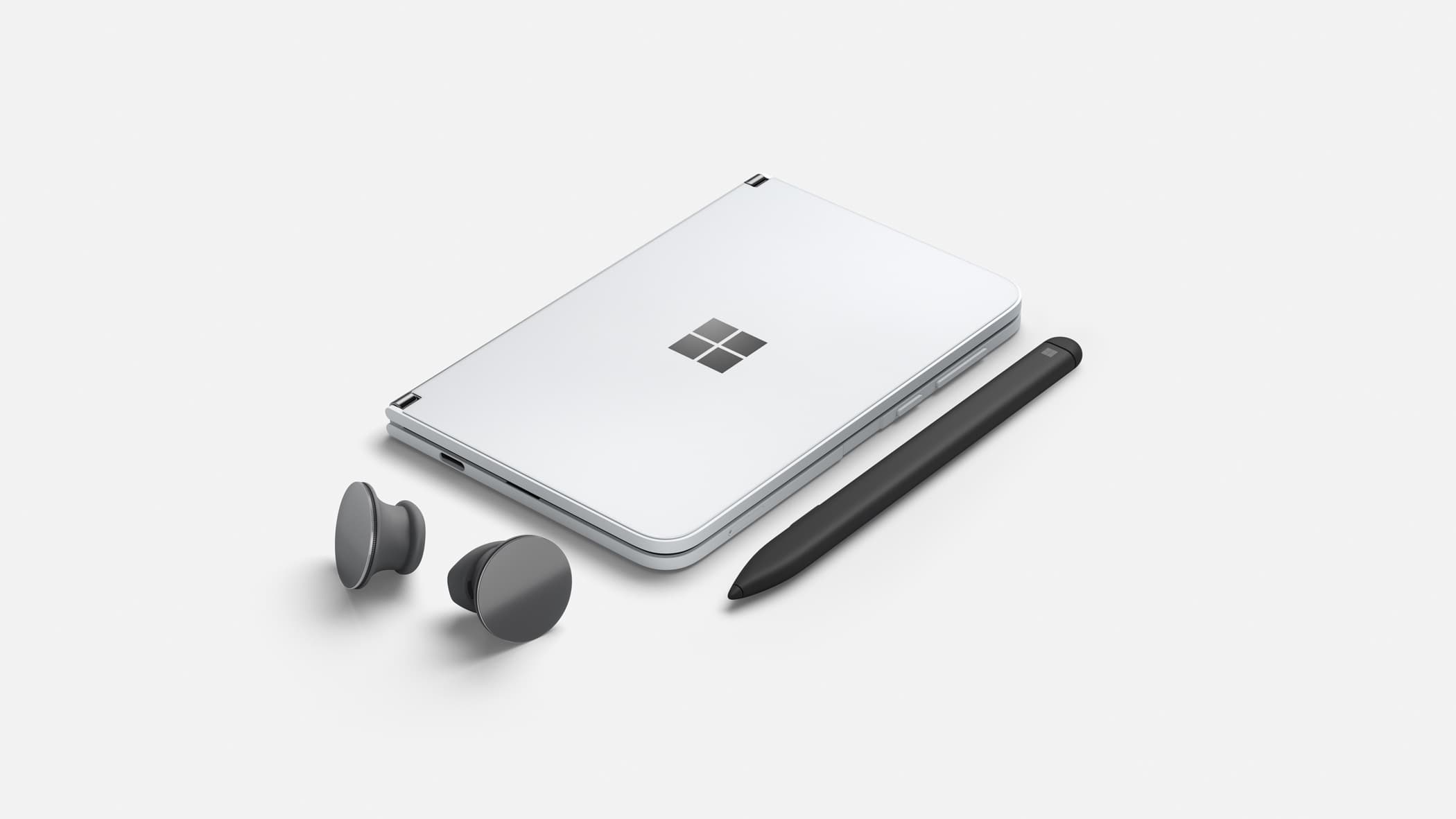
Surface Duo is the result of years of Surface design and research. Pictured with Surface Slim Pen and Surface Earbuds.
The modes
The team designed for three primary states:
Single-screen, tailored. The keyboard runs on one screen as a regular Android keyboard would, but anchored to the side the user's hand is on. The keys sit under the thumb without forcing a reach across the whole panel.
Split. A single keyboard spread across both screens, with each half landing under each thumb when the device is held in dual-screen portrait.
Compose. When the device rotates, one screen becomes a full-bleed typing surface with a much larger key area, while the active app sits on the other screen above.
Each mode is a layout problem and a transition problem. The keyboard has to know which mode it should be in given how the user is holding the device, and it has to switch between them without disrupting the typing flow.
SwiftKey in compose mode on Surface Duo.
Compose mode
Compose mode raised two problems worth working through.
The first was layout. With that much real estate, key positions can't be a function of the screen geometry alone. They have to land where the user's fingers actually settle at typing speed. A larger key array isn't automatically better; keys can sit too far apart, or fall outside the natural reach envelope, in ways that hurt typing speed compared to the standard layout it replaces. Our human factors partners helped drive positioning decisions here, and we iterated against their findings.
The second was technical. Compose mode covers an entire screen with the keyboard and Android needed to handle that gracefully. The app the user is typing into is on the other screen, and the layout below the keyboard had to keep working without anything breaking when one of the screens was effectively occluded by the input surface.
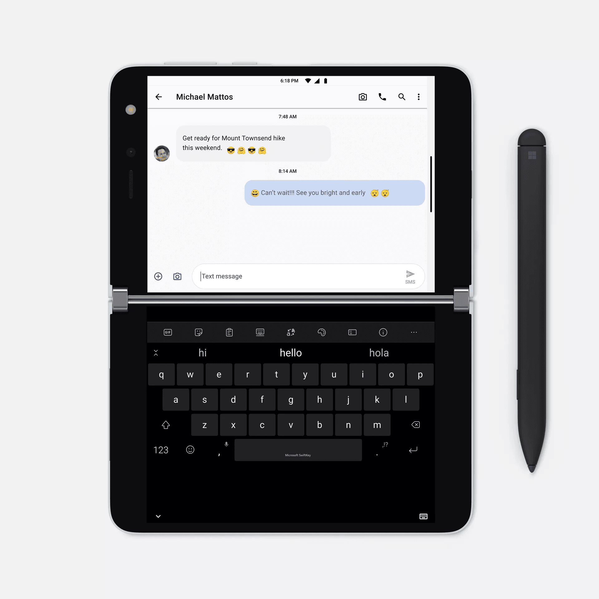
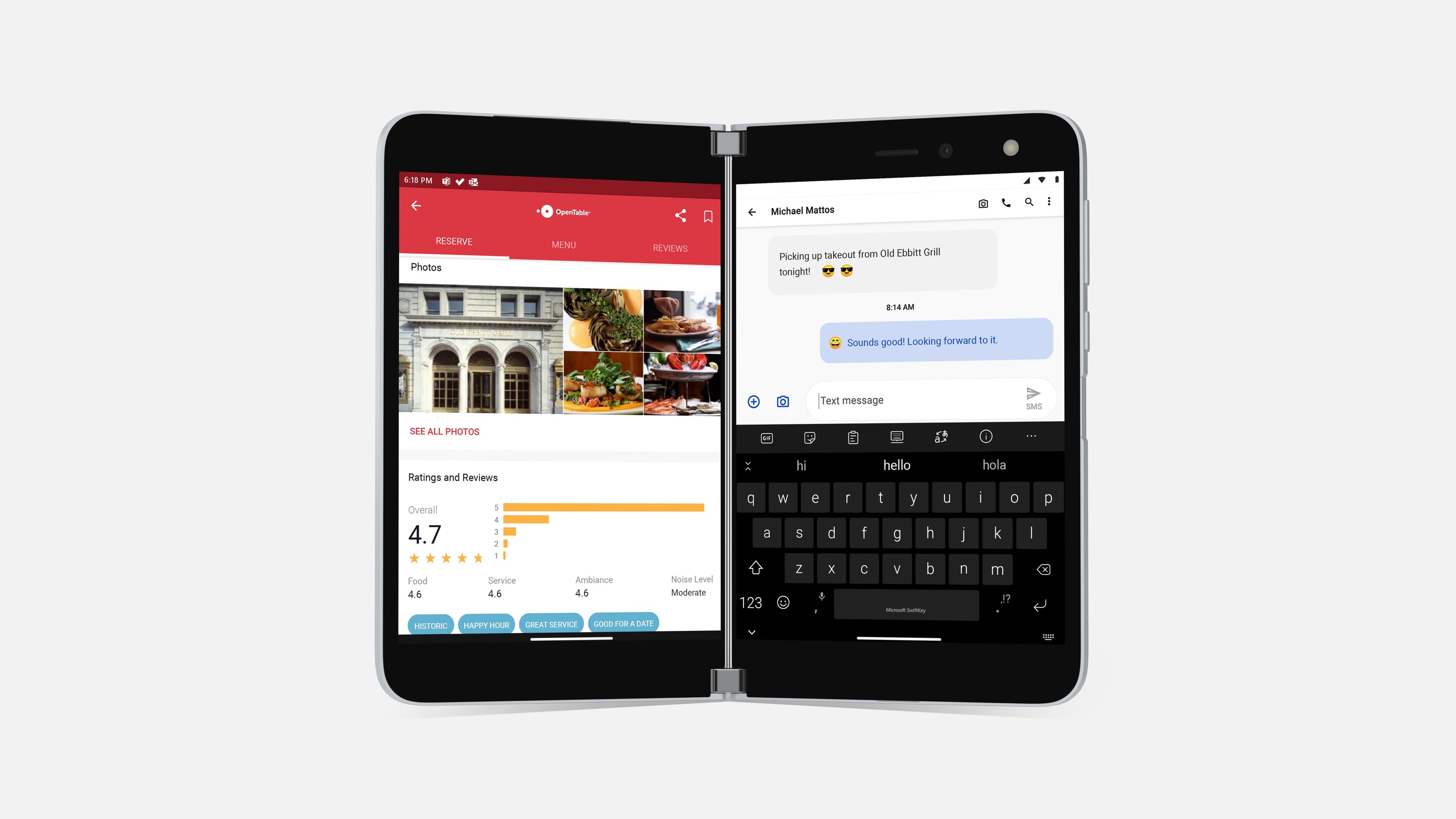
SwiftKey on Surface Duo being used to reply to a message.
Research
The team invested heavily in understanding how people actually held and used Duo: internal selfhosting across Microsoft, human factors studies, and other research sessions. Every layout call traced back to it: where the keyboard anchors in single-screen mode, the geometry of the split layout, the key positions in compose. The form factor was novel enough that design intuition alone couldn't be trusted.
Beyond the keyboard
I used the internship as a chance to go further than the keyboard and sketch what other software on this hardware could feel like, such as a weather app that treats the second screen as a deliberate surface for context the user wants to keep visible rather than just a wider canvas.
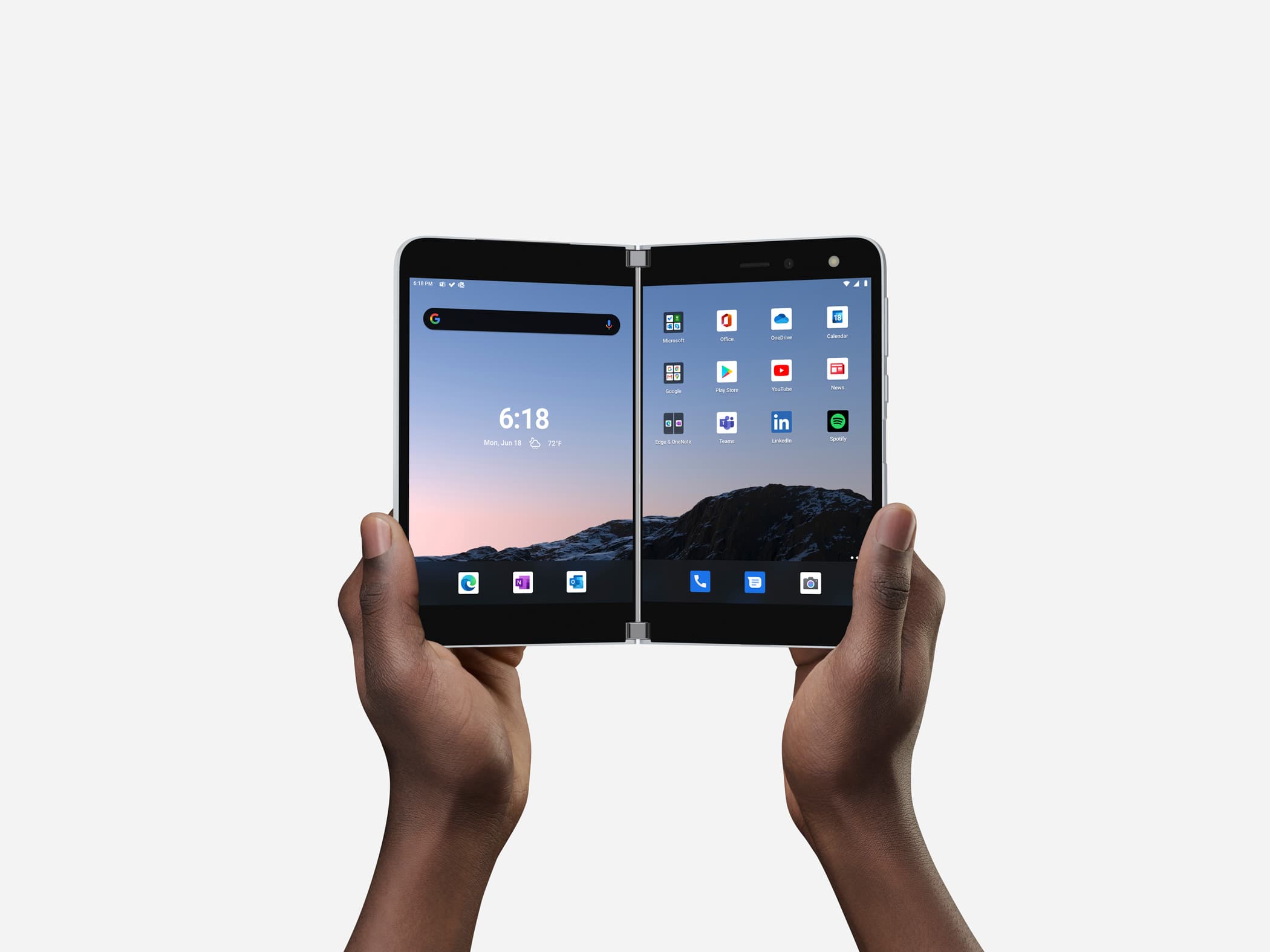
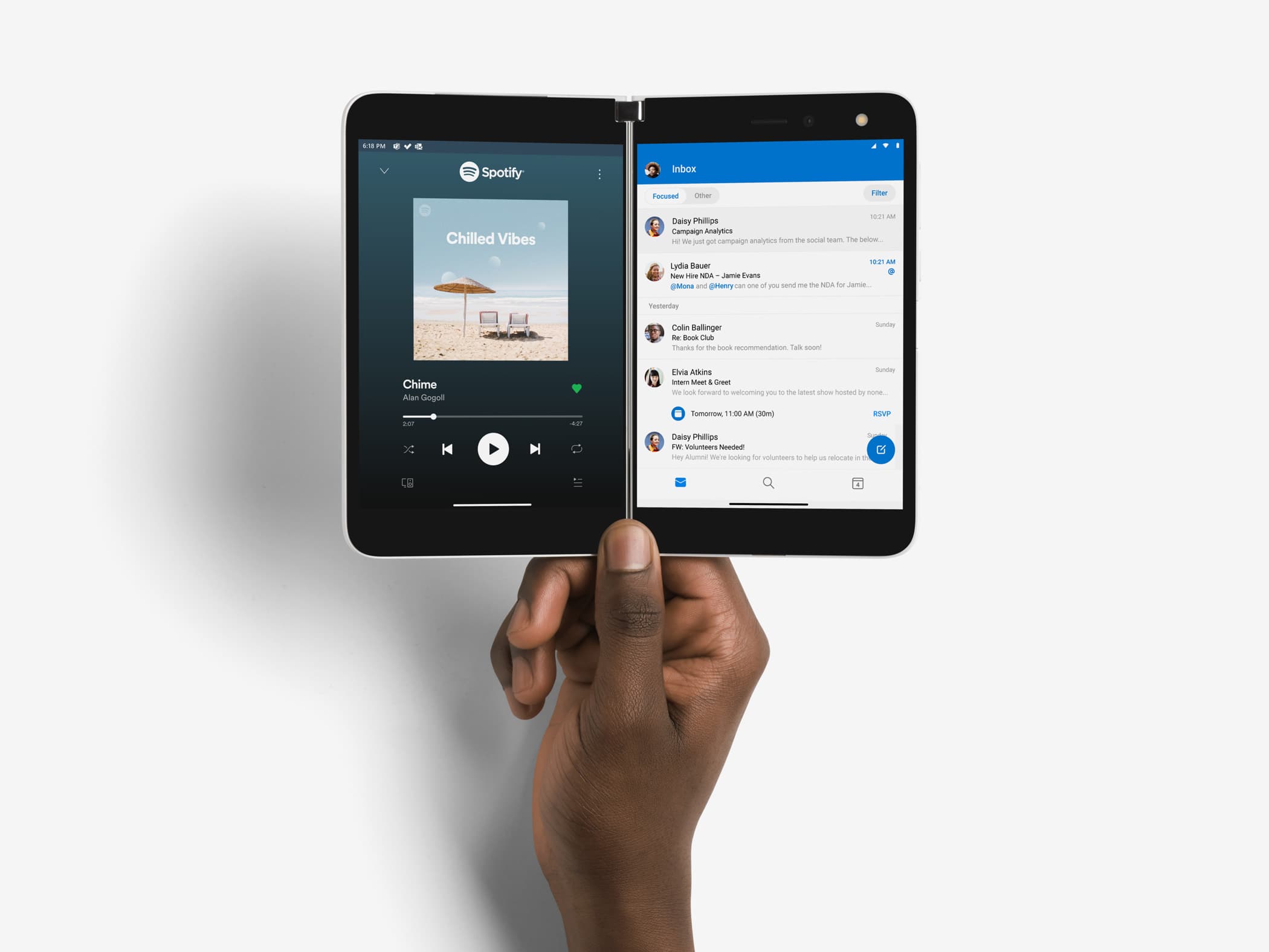
Two apps on Surface Duo, one on each screen — Spotify and Outlook.
Working alongside the Surface design team taught me how much of the feel of a new device comes from the seam between hardware and software being designed in the same room, not handed across one.